Packaging Rebrand for a cereal mix company; Oliver cereal mix
In today's competitive breakfast cereal market, standing out on crowded shelves while maintaining brand authenticity presents a significant challenge for growing companies. Oliver Cereal Mix, a family-owned business with humble beginnings, faced this exact predicament as their product line gained increasing market traction. Despite their rising popularity, the brand struggled with an inconsistent visual identity that failed to reflect their premium quality and market potential.
While Oliver Cereal Mix enjoyed growing consumer demand, their packaging and brand presence lacked the sophistication and coherence necessary to compete with established market leaders. Their existing packaging, though functional, failed to tell the brand's story effectively or create meaningful emotional connections with consumers. The company recognized that to transition from a modest market player to a premium household name, a comprehensive rebranding initiative was essential.
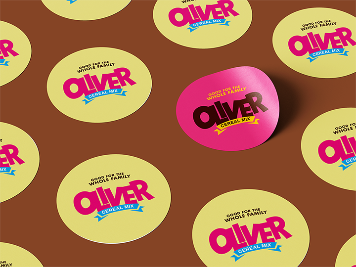
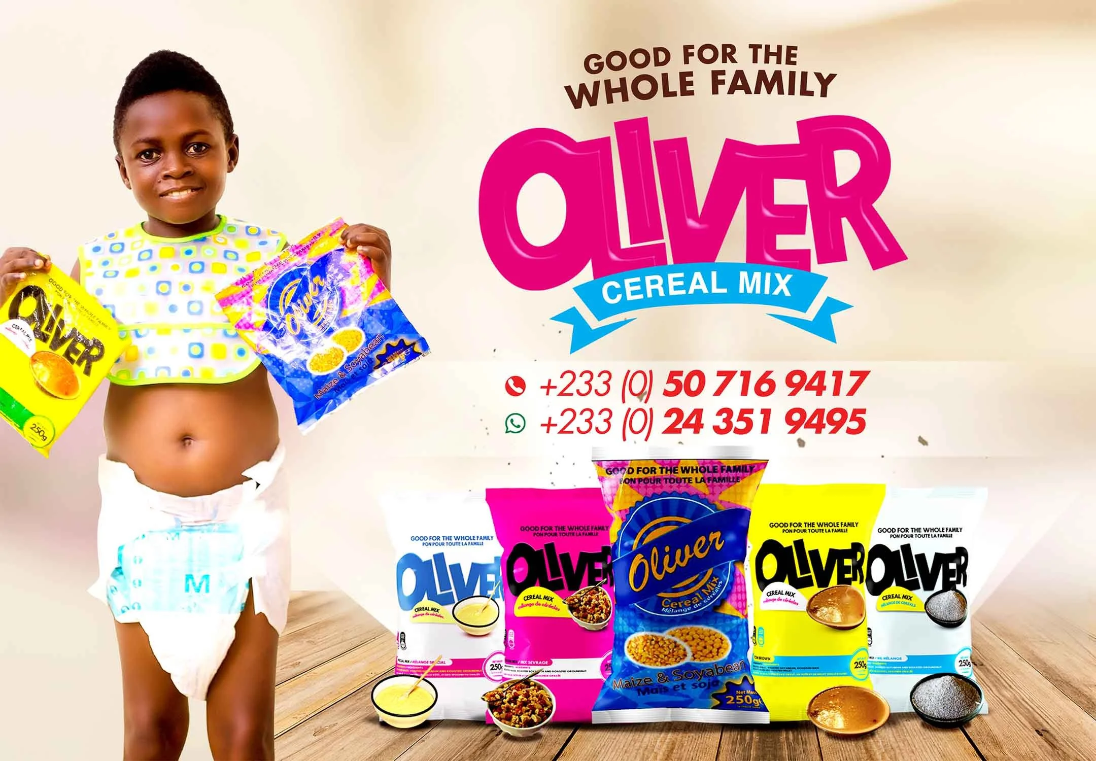
The big change was based on a smart idea: to use bright colors and vibrancy as key parts of the brand. This was done to achieve three main goals: grab attention, show the natural energy of the ingredients, and appeal to both healthy adults and kids who love color. The new design uses colors inspired by the natural ingredients - like the brown of whole grains, the red of dried berries, and the golden yellow of honey and nuts.
The packaging redesign went beyond mere aesthetics. A crucial aspect was the introduction of sustainable materials that aligned with the brand's commitment to environmental responsibility. Clear windows were strategically placed to showcase the product's quality and freshness, while the structural design was optimized for both shelf presence and user convenience. Typography received special attention, with a custom font family developed to ensure consistency across all brand touchpoints while maintaining excellent legibility at various scales.
The rebranding initiative extended beyond packaging to encompass all marketing communications. A new brand voice was developed, emphasizing the company's heritage, commitment to quality, and understanding of modern families' needs. Advertising campaigns were crafted to showcase the new visual identity while telling stories about the brand's values and products.
The transformation of Oliver Cereal Mix demonstrates the power of thoughtful design in elevating a brand's market position. By addressing both functional and emotional aspects of packaging design, the company successfully evolved from a growing local brand to a competitive player in the premium cereal segment. Their journey is an example of how strategic design thinking can drive business growth while staying true to brand values.
This comprehensive rebranding initiative not only solved the immediate challenges of brand inconsistency and limited shelf presence but also positioned Oliver Cereal Mix for sustained future growth. The new brand identity system provides a solid foundation for continued innovation and market expansion, proving that well-executed design can be a powerful drive of business transformation.


