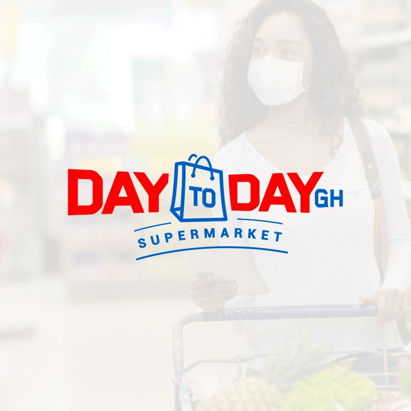
Branding and Visual Identity design for a Supermarket; Day to Day Gh
In an attempt to continue with the Day to Day shopping centre in Dubai, the challenge was to create a bold, elegant, relatable logo, a visual identity and stationeries for the brand.
The Dubai's Day to Day shopping center concept into the Ghanaian market represents a cultural adaptation and brand evolution. This project demonstrates how an established retail brand can be thoughtfully reinterpreted to resonate with a new market while maintaining its core values and service proposition.
The centerpiece of the design is a cleverly integrated paper bag motif, the Paper bag symbolising the supermarket and the written word “Day” going through one end of the paper bag to the other end, shows the 24/7 working hours of the supermarket. This familiar shape instantly communicates the brand's primary function as a supermarket while simultaneously featuring the business model as a 24/7 operational service. The way the word "Day" flows through the paper bag creates a dynamic visual narrative, suggesting constant movement and accessibility, reflecting the continuous service of the brand's value proposition.
The typography chosen for the brand identity plays a crucial role in establishing market presence. Bold, commanding letterforms project stability and reliability which are essential qualities for a retail establishment seeking to build trust in a new market.
Color plays a pivotal role in the brand's visual strategy, with red and blue serving as the primary palette. The use of red is particularly strategic, serving multiple purposes in the Ghanaian context. Beyond its universal associations with energy and excitement, red holds cultural significance in Ghana, where it's often associated with vitality and attraction. Blue, as the secondary color, provides a sophisticated counterbalance, conveying trustworthiness and professionalism. This color combination creates a visual tension that captures the brand's dual promise of excitement and reliability.
The success of this brand translation lies in its ability to respect and respond to local market conditions and also maintaining international retail standards. The 24/7 operating model represented symbolically in the logo, acknowledges the evolving needs of urban Ghanaian consumers that demand flexible shopping options.
The Day to Day Gh project is a demonstration that a brand can be translated to a more befitting consumer brand archetype.


